

Hello everyone, I am back with Sekunde part of the Artikel “How to make icon”. If Du haven’t read first part and want to read it it’s <a href=”link> here </a>
So, today I’ll explain three things. That are “Uses of brush and “How to use Color Balance”. All the two are related with coloring effect and glittering of icon. Which plays an important role.
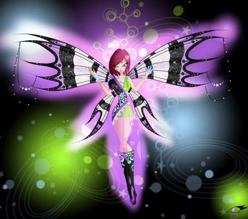
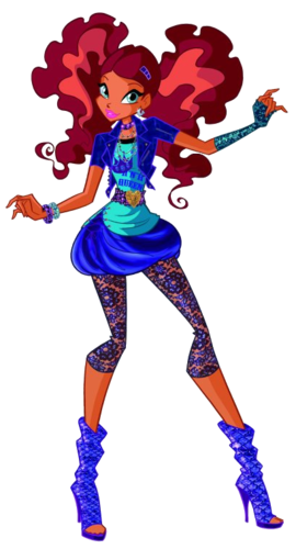
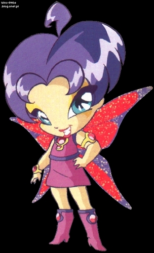
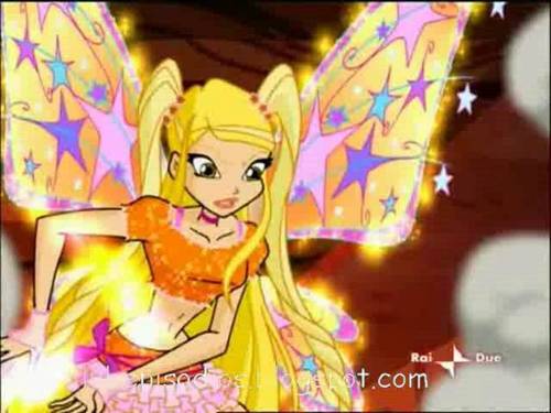
Uses of brushes : First of all Du need to download different types of brushes, usually pattern brushes (like floral brushes and background Design brushes) are less need in making Icons so refuse to download them, instead Karl star, sterne brushes and Sparkle brushes are very good for it. If Du use Soft edge brush then it’s just perfect as it add special touch to the icons. One of Icon (which Du can see) is looking like it’s glowing because of “soft edge” brush. So in all it give awesome result and Du don’t have to do so much of “hard work” for it. And remember don’t use it “too much” and it can spoil your icon, two three times using it is enough.
On the other hand, Du can use “soft edge brush” in other way too.
Steps
1. Increase size of brush
2. Choose color (try yellow as it Suits every icon)
3. Decrease opacity (don’t decrease tolerance as it’ll decrease color’s density)
4. Apply brush (soft edge brush) on edges only.
5. Here Du go, Du can see yellowish effect in your Icon
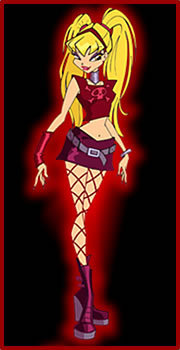
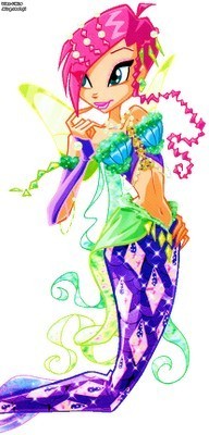
 with brush, it'd not so good because I made it in hurry")
nother example of giving effect (reddish) with brush, it'd not so good because I made it in hurry
Now comes the Sekunde topic “Color balance” oder “Channel Mixer” it’s basically used to give color effect and very easy to use.
In color balance, Du can adjust the color accommodation. Du can increase reddish/cyan effect , green effect oder yellow effect. It’s the easiest thing and really give great look to your icons.

Before and after using color balance
In part three I will tell Du how to add texts , it’ll be totally based on texts in Icons