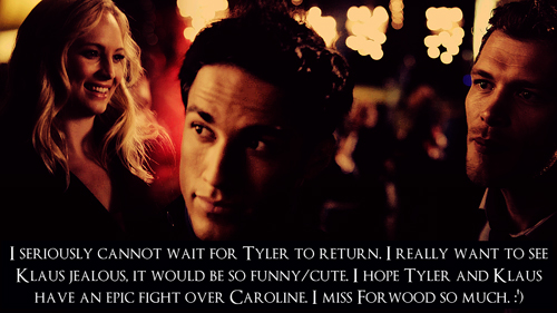

So, according to link, most of Du want a tutorial for the Emilia icon. But, since many have been asking for the other two on Sekunde place as well, I decided to make a tutorial for each of the three of them. Du can find whichever Du want below.
The program I use is Adobe Photoshop CC, any other version photoshop should have similar if not the same settings I'm using. If you're using another program, tell me and I'll see what I can tell you.
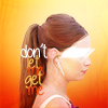
This one is for this icon:

This Icon was actually pretty easy. I don't remember having much struggle with it except for the side of her face being way too red, but that resolution is for later. Let's get to it.
First, take your original image. I made this Icon for a 20in20 icontest on LJ, and the theme was profile, so I chose this beautiful Profil Icon of the beautiful Emilia.

My Guter Rat to Du is to get larger images, because when Du resize them to smaller sizes, their quality becomes amazing.
After you've cropped and resized your image (I usually Bearbeiten 100x100 icons, working on lager ones and then resizing them does not work well with me, I only like the view of the original image when resized.) Du cut out the original background. Apply some brightness edits (brightness/contrast, levels, curves, etc.) to brighten your Icon up a bit if Du want as well.


After this, Du apply the background Von going to file > open and selecting the background of your choice. I got mine from a user I don't remember on Livejournal.

|
v

Next, I added a levels layer with the custom preset, set on RGB, and these settings: 20, 1.00, 244 to add some depth and color to Emilia.
Then I added a Foto filter layer on color. The color is a nice pinkish one, #ff6a6a. The density is 25% and the 'preserve luminosity' box is checked.
Afterwards I added a vibrance layer.
Vibrance: +43, Saturation: +12.
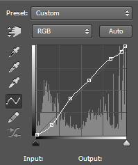
It looked all too not right for me, so I set a curves layer. It's gonna take a while explaining exactly how I did it, but here's a screenshot of the path:

At this point I guess I decided to make the lights on Emilia similar to the bg, so I darkened/redenned her up with another vibrance layer. This time the vibrance is set to 100 and saturation to -12.
This made the Icon way too deep, so I brought out its Farben Von making a gradient fill layer.
I selected the black and white gradient and changed the black box's color to #b49c87, and the white box's to #ffe4a3. I didn't change any other settings except setting the layer's opacity to 73%.
Still, I felt the Icon was missing something, so I added another gradient, this time a normal black and white one, without changing anything to its settings.

As Du can clearly see, her hair looks pretty good, but her face is way too red. I remember struggling with this a little, as I've sagte previously. I created a vibrance layer, and it either went too far oder too back, I ended up with setting the vibrance to -6, saturation to -15, and letting it go.
Of course, there was also her frown that sort of ruined the view, so I crossed it out with a white brush. The brush I used was a tilted, very thin oval that Du can find in calligraphic brushes. I always suggest Du make a new layer when drawing on your art, because then you'll be able to erase just the parts Du don't want instead of going back in history and erasing the whole thing

To add a little softness to the Icon I stamped the layers again and went to filter > filter gallery > brush strokes> angled strokes. I don't remember the settings exactly, it's all up to Du anyways, but I suggest Du keep the sharpness at 0. This is for the background, mostly, which means we will erase it from the focus (Emilia), so only pay attention to the strokes on the background.
Du can either erase it with an eraser oder a layer mask (I prefer the latter). Set your eraser oder brush to a big, soft kreis one, (around 65 pixels) and blob on the focus and a bit around it as well until the strokes are only visible at the edges. It will only Zeigen as if you've softened the edges, really. Set the opacity to 43%.
Next, stamp the layers one Mehr time and go to Image > adjustments> variations. Click on 'original' (top left corner for those who don't know) then on yellow, red, lighter in that order. Set the layer to screen and opacity to 43 %.

Looks pretty good but I still thought something's missing. So I took another texture from LJ.

I set it to soft light and erased the white kreis and the are around it Von blobbing with that same brush.
To finally get rid of the not so great looking cheek under the covered eyes, I set another texture.

I set it on soft light and erased it so its yellow parts would only cover Emilia's cheek.

Optional: Add text (I used A Little Sunshine) and you're done. If Du have any questions, feel free to ask.
The program I use is Adobe Photoshop CC, any other version photoshop should have similar if not the same settings I'm using. If you're using another program, tell me and I'll see what I can tell you.
This one is for this icon:

This Icon was actually pretty easy. I don't remember having much struggle with it except for the side of her face being way too red, but that resolution is for later. Let's get to it.
First, take your original image. I made this Icon for a 20in20 icontest on LJ, and the theme was profile, so I chose this beautiful Profil Icon of the beautiful Emilia.

The image is in way better quality, but it's way too big to fit in this space, so I had to set it to medium size and Fanpop sucks with the quality of that.
My Guter Rat to Du is to get larger images, because when Du resize them to smaller sizes, their quality becomes amazing.
After you've cropped and resized your image (I usually Bearbeiten 100x100 icons, working on lager ones and then resizing them does not work well with me, I only like the view of the original image when resized.) Du cut out the original background. Apply some brightness edits (brightness/contrast, levels, curves, etc.) to brighten your Icon up a bit if Du want as well.

The bg will appear checkered on photoshop if the layer is unlocked, so make sure it is.

I prefer using the quick selection tool and then softening the edges with a layer mask oder the eraser tool.
After this, Du apply the background Von going to file > open and selecting the background of your choice. I got mine from a user I don't remember on Livejournal.

|
v

Next, I added a levels layer with the custom preset, set on RGB, and these settings: 20, 1.00, 244 to add some depth and color to Emilia.
Then I added a Foto filter layer on color. The color is a nice pinkish one, #ff6a6a. The density is 25% and the 'preserve luminosity' box is checked.
Afterwards I added a vibrance layer.
Vibrance: +43, Saturation: +12.
It looked all too not right for me, so I set a curves layer. It's gonna take a while explaining exactly how I did it, but here's a screenshot of the path:
At this point I guess I decided to make the lights on Emilia similar to the bg, so I darkened/redenned her up with another vibrance layer. This time the vibrance is set to 100 and saturation to -12.
This made the Icon way too deep, so I brought out its Farben Von making a gradient fill layer.
I selected the black and white gradient and changed the black box's color to #b49c87, and the white box's to #ffe4a3. I didn't change any other settings except setting the layer's opacity to 73%.
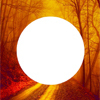
Still, I felt the Icon was missing something, so I added another gradient, this time a normal black and white one, without changing anything to its settings.

the Icon so far
As Du can clearly see, her hair looks pretty good, but her face is way too red. I remember struggling with this a little, as I've sagte previously. I created a vibrance layer, and it either went too far oder too back, I ended up with setting the vibrance to -6, saturation to -15, and letting it go.
Of course, there was also her frown that sort of ruined the view, so I crossed it out with a white brush. The brush I used was a tilted, very thin oval that Du can find in calligraphic brushes. I always suggest Du make a new layer when drawing on your art, because then you'll be able to erase just the parts Du don't want instead of going back in history and erasing the whole thing

To add a little softness to the Icon I stamped the layers again and went to filter > filter gallery > brush strokes> angled strokes. I don't remember the settings exactly, it's all up to Du anyways, but I suggest Du keep the sharpness at 0. This is for the background, mostly, which means we will erase it from the focus (Emilia), so only pay attention to the strokes on the background.
Du can either erase it with an eraser oder a layer mask (I prefer the latter). Set your eraser oder brush to a big, soft kreis one, (around 65 pixels) and blob on the focus and a bit around it as well until the strokes are only visible at the edges. It will only Zeigen as if you've softened the edges, really. Set the opacity to 43%.
Next, stamp the layers one Mehr time and go to Image > adjustments> variations. Click on 'original' (top left corner for those who don't know) then on yellow, red, lighter in that order. Set the layer to screen and opacity to 43 %.

Doing this added light to the icon
Looks pretty good but I still thought something's missing. So I took another texture from LJ.
I set it to soft light and erased the white kreis and the are around it Von blobbing with that same brush.
To finally get rid of the not so great looking cheek under the covered eyes, I set another texture.

I set it on soft light and erased it so its yellow parts would only cover Emilia's cheek.

Optional: Add text (I used A Little Sunshine) and you're done. If Du have any questions, feel free to ask.