
Hey there,
So I decided to make a GIMP tutorial, hoping that it will be useful for you. I'm not really a Gimp specialist, but I've worked with that programm before I got Photoshop and there are some things I know that might be interesting for you.
So, first, GIMP can be downloaded for free.
I've a download link for GIMP 2.6.4. here : link
(wow took me ages to find a version that's not german Oo)
This works, I just downloaded it from there too, because before I had a german version and for the tutorial I need to know the english words.
And your number 1 screencap Quelle is: link
So, after you've installed GIMP, we can continue.
I'll Zeigen Du now how to go from this to...


I'm assuming Du know how to crop your screencap and make it 100px x 100px.
If Du have this, we'll sharpen it a little.
*)Filters > Enhance > Unsharp mask
Set radius to 0.5
So, our image is a little dark,so we do this:
*)First look at the long toolbox on the left side of GIMP. No matter which tool Du select, there should be a little Arrow that Du can click and when Du click it Du can select >Add Tab >Layers.[u]
This is important! Now the layers are shown in the toolbox on the left side and we can see which layer we are working on :)
We have atm only one layer, which is called background and which shows us our beautiful dark Cuddy.
Now we Bewegen away from the toolbox on the left again and back to the main image, where it also says file, edit, select, view and so on.
There we [u]click Layer > Duplicate Layer
When we look back to our toolbox we now see that we have 2 Cuddy layers which look identical.
The new layer is called background copy. We select this layer and set the mode to Addition.
Voila, suddenly our Cuddy Icon isn't as dark anymore. :)
*) Now right click on the background copy layer and select Duplicate layer again. Now the Icon gets even brighter, but a little too bright now, so we set the opacity of our new background copy 1 to about 50% !
*) Now that this is done, right click on the background layer and choose > Flatten image
Now the 3 layers are 1 again.
Now we already have a much nicer Icon than at the beginning. Du can stop here, if Du are already happy, oder Du can go on and play with the colors.
*)Go to colors >Color Balance
Set the midtones to yellow -80 and
the highlights to blue +45, then click ok
Again, Du can stop here oder go on.
*)In the toolbox, Du see a color field. Click on it to change the color and set it to: 524cdb
*)Click then Layer > New Layer and select Foreground color. Then our beautiful Cuddy is gone and there is only the blue Icon left.
Dont panic xD
*) Set the new layer's mode to : difference
Looks horrible, doesn't it? Well, what are Du waiting for, reduce the opacity! To about 30%, but that depends on the Icon and on your taste as well. ;]
If Du have done this, right-click and flatten the image, so your 2 layers are 1 layer again.
Wanna go on? xD How about adding a beautiful brush to our beautiful Cuddy?
Wanna do it? Okay
*) SAVE your Icon somewhere you'll find it again and then CLOSE your whole GIMP programm.
Then follow this link link and download the brushes Von simply clicking download.
After you've downloaded it, Du need to extract the files and save them on your pc. Then copy them all and paste them into [wherever Du saved GIMP on your pc before] - GIMP-2.0 -> share -> gimp -> 2.0 -> brushes
After that Du can open GIMP and your Icon again.
*) Select now the Paintbrush tool in the toolbox and set the color field to this color: e5fb4e.
Then below, where it says Brush: Du click the field, scoll down a little and Du see symbols. Make sure Du select the -GIMP Brush#5-
Also, set the opacity to about 44% and then put the brush on the left side of your icon. :) There Du should now have a yellowish box.
Wanna make more?
*)Set the color field to white and this time choose a different brush -> GIMP Brush#14
Set the opacity this time to 100% !
*)Put the brush on the bottom of your icon. I didn't let the white box go into the yellow box.
Now Du can either leave it like that oder write something into the white box, that's what I did.
*)So Du go to the big A on the toolbox for text tool.
Then Du choose a color below (this time not in the big color field, there's now an extra color field)
I chose this color: 141425
*) Now also choose a FONT ( i took Segoe Print Bold)and then click on the write box to write something clever. (you might also change the size and so on.)
If the text isn't in the right position, go away from the text tool and choose the blue arrows, the so called move tool to Bewegen the text.
*)When the text is in the right position, click on the layers dialog in the toolbox again, oder CTRL+L, if Du don't find it and right-click > flatten image -> so now the text layer is combined with the Cuddy Icon layer.
and.... Du ARE DONE!! ♥ I'm so proud Du did it. :)
Save the picture and Upload it to fanpop! :)
important
The outcome depends also on the screencaps Du use. Some screencaps are Mehr yellowish, while others are Mehr bluish, oder some are darker and some are brighter. So the Farben that come out when Du use this tutorial, might vary! But I think this tutorial gives a good basic information of what options Du have when Du make an Icon with GIMP.
So I decided to make a GIMP tutorial, hoping that it will be useful for you. I'm not really a Gimp specialist, but I've worked with that programm before I got Photoshop and there are some things I know that might be interesting for you.
So, first, GIMP can be downloaded for free.
I've a download link for GIMP 2.6.4. here : link
(wow took me ages to find a version that's not german Oo)
This works, I just downloaded it from there too, because before I had a german version and for the tutorial I need to know the english words.
And your number 1 screencap Quelle is: link
So, after you've installed GIMP, we can continue.
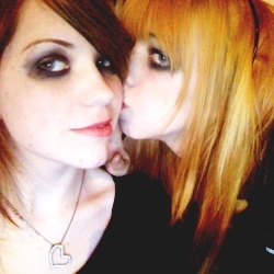
I'll Zeigen Du now how to go from this to...

from this

to this
I'm assuming Du know how to crop your screencap and make it 100px x 100px.
If Du have this, we'll sharpen it a little.
*)Filters > Enhance > Unsharp mask
Set radius to 0.5
So, our image is a little dark,so we do this:
*)First look at the long toolbox on the left side of GIMP. No matter which tool Du select, there should be a little Arrow that Du can click and when Du click it Du can select >Add Tab >Layers.[u]
This is important! Now the layers are shown in the toolbox on the left side and we can see which layer we are working on :)
We have atm only one layer, which is called background and which shows us our beautiful dark Cuddy.
Now we Bewegen away from the toolbox on the left again and back to the main image, where it also says file, edit, select, view and so on.
There we [u]click Layer > Duplicate Layer
When we look back to our toolbox we now see that we have 2 Cuddy layers which look identical.
The new layer is called background copy. We select this layer and set the mode to Addition.
Voila, suddenly our Cuddy Icon isn't as dark anymore. :)
*) Now right click on the background copy layer and select Duplicate layer again. Now the Icon gets even brighter, but a little too bright now, so we set the opacity of our new background copy 1 to about 50% !
*) Now that this is done, right click on the background layer and choose > Flatten image
Now the 3 layers are 1 again.
Now we already have a much nicer Icon than at the beginning. Du can stop here, if Du are already happy, oder Du can go on and play with the colors.
*)Go to colors >Color Balance
Set the midtones to yellow -80 and
the highlights to blue +45, then click ok
Again, Du can stop here oder go on.
*)In the toolbox, Du see a color field. Click on it to change the color and set it to: 524cdb
*)Click then Layer > New Layer and select Foreground color. Then our beautiful Cuddy is gone and there is only the blue Icon left.
Dont panic xD
*) Set the new layer's mode to : difference
Looks horrible, doesn't it? Well, what are Du waiting for, reduce the opacity! To about 30%, but that depends on the Icon and on your taste as well. ;]
If Du have done this, right-click and flatten the image, so your 2 layers are 1 layer again.
Wanna go on? xD How about adding a beautiful brush to our beautiful Cuddy?
Wanna do it? Okay
*) SAVE your Icon somewhere you'll find it again and then CLOSE your whole GIMP programm.
Then follow this link link and download the brushes Von simply clicking download.
After you've downloaded it, Du need to extract the files and save them on your pc. Then copy them all and paste them into [wherever Du saved GIMP on your pc before] - GIMP-2.0 -> share -> gimp -> 2.0 -> brushes
After that Du can open GIMP and your Icon again.
*) Select now the Paintbrush tool in the toolbox and set the color field to this color: e5fb4e.
Then below, where it says Brush: Du click the field, scoll down a little and Du see symbols. Make sure Du select the -GIMP Brush#5-
Also, set the opacity to about 44% and then put the brush on the left side of your icon. :) There Du should now have a yellowish box.
Wanna make more?
*)Set the color field to white and this time choose a different brush -> GIMP Brush#14
Set the opacity this time to 100% !
*)Put the brush on the bottom of your icon. I didn't let the white box go into the yellow box.
Now Du can either leave it like that oder write something into the white box, that's what I did.
*)So Du go to the big A on the toolbox for text tool.
Then Du choose a color below (this time not in the big color field, there's now an extra color field)
I chose this color: 141425
*) Now also choose a FONT ( i took Segoe Print Bold)and then click on the write box to write something clever. (you might also change the size and so on.)
If the text isn't in the right position, go away from the text tool and choose the blue arrows, the so called move tool to Bewegen the text.
*)When the text is in the right position, click on the layers dialog in the toolbox again, oder CTRL+L, if Du don't find it and right-click > flatten image -> so now the text layer is combined with the Cuddy Icon layer.
and.... Du ARE DONE!! ♥ I'm so proud Du did it. :)
Save the picture and Upload it to fanpop! :)
important
The outcome depends also on the screencaps Du use. Some screencaps are Mehr yellowish, while others are Mehr bluish, oder some are darker and some are brighter. So the Farben that come out when Du use this tutorial, might vary! But I think this tutorial gives a good basic information of what options Du have when Du make an Icon with GIMP.


My dress XD